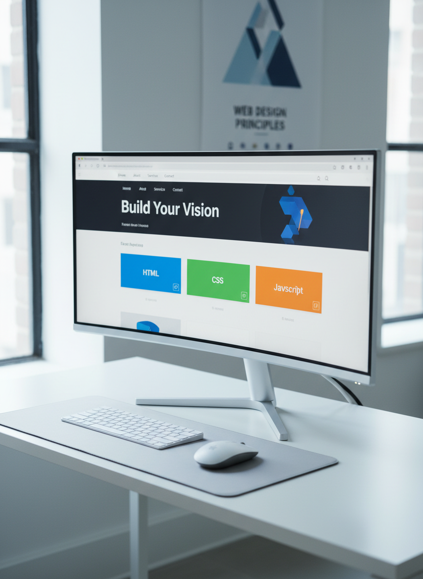
A large, ultra-wide computer monitor on a minimalist white desk, showing a modern web page layout in a visual editor: clear navigation bar, hero section, and responsive grid of colorful cards labeled HTML, CSS, and JavaScript. Beneath the monitor, a compact wireless keyboard and mouse sit perfectly aligned on a soft gray desk mat. Cool, diffused natural light from a nearby window creates a clean, even illumination, with soft shadows under the monitor stand. The background is a softly blurred wall with a simple geometric poster about web design. Captured from a slightly elevated three-quarter angle, the photographic image feels organized, modern, and educational, ideal for introducing web development concepts.

JavaScript Basics

Get a quick overview of how JavaScript powers modern websites and enhances your learning path.

JavaScript

JavaScript runs in your browser, making pages interactive by reacting to clicks, updating content instantly, and talking to servers without reloading. Visit our Frontend vs Backend guide to see where JavaScript fits.

A close-up of a glossy black tablet lying flat on a smooth birch wood desk, its bright screen showing a simple HTML document on the left and the rendered webpage preview on the right. The code includes colorful tags and comments explaining each section. To the side rests a neatly coiled white USB-C cable and a small stack of pastel sticky notes with tiny drawn icons of tags and brackets. Soft, warm overhead lighting gently highlights the tablet’s beveled edges and creates subtle reflections on the glass. Shot from a top-down, bird’s-eye perspective, the composition is tidy and balanced, with sharp focus throughout, conveying an approachable, student-friendly feel in a clean photographic style.

Practice

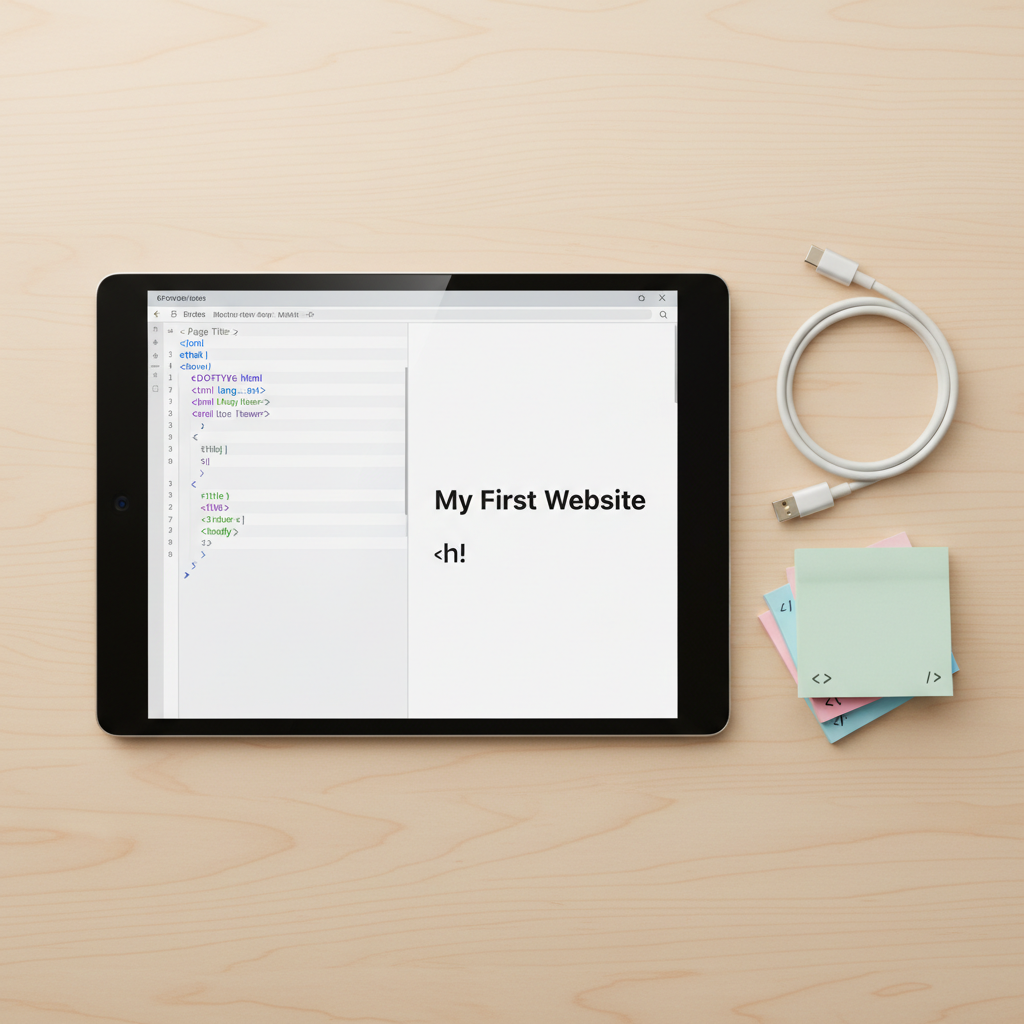
Reinforce your JavaScript skills with short quizzes, hands-on exercises, and mini projects like to-do lists and sliders, designed to turn theory into real, confidence-building experience.

An open notebook-style sketchpad on a matte white desk, filled with neatly drawn wireframes of a responsive website: desktop, tablet, and mobile layouts aligned across the pages, with labeled headers, buttons, and content blocks. Beside the sketchpad lie two fine-line black pens and a cool gray ruler. A slim silver laptop is partially visible at the frame’s edge, closed. Soft morning sunlight streams diagonally from the top right, casting crisp but gentle shadows from the pens and ruler, adding depth and texture to the paper. Photographed from a slightly elevated angle with sharp focus and generous negative space, the scene feels intentional, modern, and instructive, ideal for conveying the planning stage of web development in a realistic photographic style.